 кодер.укр
Шаблон, который обеспечит основные нужды для различных разрешений экрана настольных компьютеров, мобильных устройств и планшетов:
/* Large desktops and laptops */
media (min-width: 1200px) {

}

/* Portrait tablets and medium desktops */
media (min-width: 992px) and (max-width: 1199px) {

}

/* Portrait tablets and small desktops */
media (min-width: 768px) and (max-width: 991px) {

}

/* Landscape phones and portrait tablets */
media (max-width: 767px) {

}

/* Landscape phones and smaller */
media (max-width: 480px) {

}


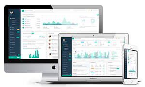 Подборка адаптивных шаблонов для вашей CMS
 Статьи по
  Как получить и установить HTTPS сертификат на сайта


Комментарии
Комментарии отсутствуют, Вы можете быть первым